Refutation of Data Colada Claims about the 2012 PNAS Paper
Among Data Colada’s four-part series disparaging of my work is their June 17, 2023, blog post relating to Study 1 in the 2012 paper “Signing at the beginning makes ethics salient and decreases dishonest self-reports in comparison to signing at the end” (published in the Proceedings of the National Academy of Sciences, in short form “2012 PNAS paper”). Data Colada alleged that the study relies on data manipulation. An HBS report concluded much the same thing. They are both wrong.
The Allegation
Data Colada’s critique of Study 1 is grounded in three inferences they draw from the data posted to the Open Science Framework (OSF).
Data Colada identifies eight rows of data that they consider suspicious. Two of these rows have duplicate IDs and six have IDs that are out-of-sequence.
Data Colada claims that these eight suspicious rows have extreme values, showing a huge effect.
Data Colada claims that the eight suspicious rows were a consequence of data tampering by me. They use Excel’s calcChain feature as evidence for their claim.
All three inferences are wrong, as I establish in this post.
Data Colada cherry-picked the data it chose to include in its analysis.
It is true that the data in this study includes rows with duplicate IDs, as well as rows with out-of-order sequences. Below, I will describe how this is likely to have happened. But first, it is important to note that Data Colada cherry-picked the observations to include in its analysis—using observations that supported their claim that I manipulated data, while omitting observations that weakened their claim.
Specifically:
When it comes to duplicate IDs, Data Colada included rows 52 and 53 (ID 49), but they omitted rows 5 and 75, which also have duplicate IDs (ID 13).
When it comes to out-of-sequence observations, Data Colada included six observations, but they did three very curious things here:
They included two observations that are in fact not out-of-sequence—namely, Row 69 (ID 101) and Row 70 (ID 7).
They mentioned Row 33 (ID 64) as being out-of-sequence, but they omitted it from their analysis.
Although Row 73 (ID 5) is also out-of-sequence, they failed to mention it, and they omitted it from their analysis.
It’s troubling that Data Colada cherry-picked data in this manner and without explanation. I’ve included additional details about these errors in Appendix 1.
In addition, Data Colada excluded one of the three conditions in the study. This exclusion of the third condition, combined with the cherry-picking of data, enabled Data Colada to create an enormously misleading impression.
The published study actually had three experimental conditions. Data Colada only examined conditions 1 and 2, entirely omitting condition 0 (the control condition). By omitting this control condition and cherry-picking observations within conditions 1 and 2, Data Colada was able to make the argument that the suspicious rows contained extreme values that drove huge effects.
According to their analysis, when running a t-test considering the eight observations they flagged in conditions 1 and 2 of the study, the p-value is highly significant [t(6) = 21.92, p < .000001]. Here is the compelling figure they used to underscore their conclusion:
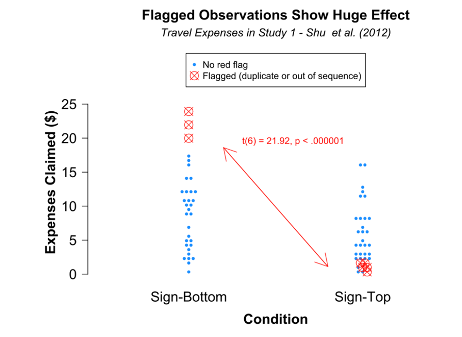
I re-ran the analysis across all conditions, using all of the duplicate and out-of-sequence observations while omitting the two observations that actually were not out of sequence. This leaves 10 observations, and the test results for these observations are far less dramatic. In fact, these ten do not even reach statistical significance [F(2,9) = 3.28, p = .099].
In other words, using Data Colada’s very own “rules” for flagging suspicious data, the “huge effect” disappears when the observations are no longer cherry-picked.
Here is the correct figure:
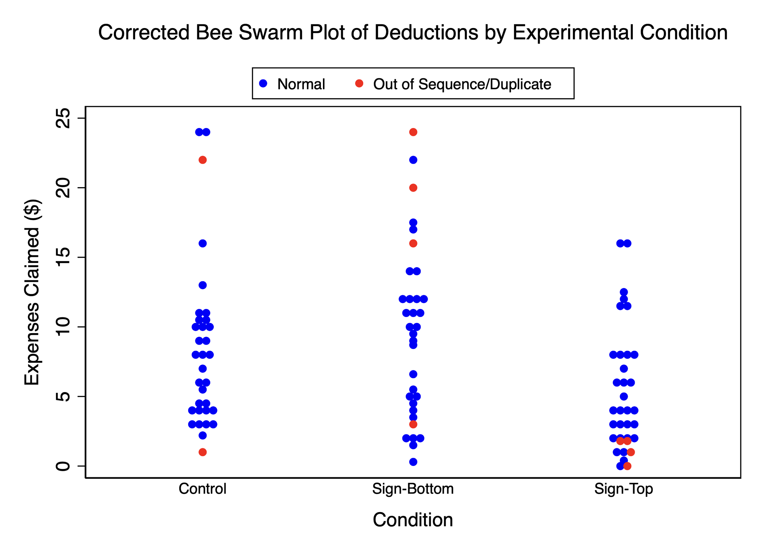
As the corrected bee swarm plot shows, the Data Colada narrative collapses when including the third condition and the correct data points for conditions 1 and 2.
Furthermore, when I excluded all 10 of the flagged observations due to their “suspicious” nature, and then re-ran the analysis using the remaining observations, the findings of the original study still hold.
This finding speaks directly to motive. My accusers think I manipulated data to drive results. But this analysis demonstrates that even without all the observations that, according to Data Colada’s own rules, should be considered “suspicious,” the findings of the original study still hold.
Because this point is of such critical importance, I’ve included additional analyses in Appendix 2. These analyses also re-run the study results using all three dependent variables (DVs) used in the original study. This is another critical point: The original study had three DVs. Data Colada inexplicably only analyzes one of these three DVs in their blog post, perhaps because an analysis of the other two DVs fails to support their allegations at all. This is another example of Data Colada making a deliberate choice about what to share with readers, and what not to share. Their post offers no explanation for this, nor do they warn readers that they report results from only one of the three DVs, and the other two show no such pattern.
Data Colada completely misrepresented Excel’s calcChain feature in order to buttress their claim that I tampered with data
I have recently learned a lot about Excel’s calcChain feature. I carefully reviewed the documentation Microsoft provides about this feature, and I ran hands-on tests to figure out how it works.
Data Colada claimed they were able to use Excel’s calcChain feature to tell “whether a cell (or row) containing a formula has been moved, and where it has been moved to.” Data Colada also claimed an analyst could “use calcChain to go back and see what this spreadsheet may have looked like… before it was tampered with.”
These statements are both misleading and irresponsible. No Microsoft documentation supports using calcChain in this way or indicates calcChain was designed to work this way. Quite the contrary, Microsoft is clear in stating calcChain’s actual purpose (“indicates the order in which the cells were last calculated”) and even in alerting readers that Excel can change calcChain on its own as it optimizes calculation speed. As I’ve learned, the way Data Colada purported to use calcChain is not the way calcChain should ever be used, because calcChain just doesn’t do what Data Colada says it does.
Three examples show the rows in calcChain can get out-of-sequence through benign actions, without any manipulation of data whatsoever, as well as how it is possible to manipulate data and not have it show up in calcChain. You can refer to Appendix 3 for a detailed description of these examples, including instructions on how to reproduce the results:
Example 1: Excel’s “fill cursor” puts calcChain out-of-sequence. Most Excel users have used Excel’s “fill cursor,” a plus sign that, when dragged, extends a formula into adjacent cells. This is a simple, routine Excel procedure. In Appendix 3a, I demonstrate how using the “fill cursor” – without any manipulation of order or anything else – can result in a calcChain that is out-of-sequence.
Example 2: Some Excel move commands create an out-of-sequence calcChain, but others don’t. In Appendix 3b, I compare two features that users often invoke interchangeably to achieve the same effect: Copy-Paste and Drag-and-Move. In the latter case, calcChain tracks the change. In the former case, calcChain does not. In other words, some of these moves are recorded; others are not.
Example 3: Sorting can reorder a calcChain. When a user uses the sorting function on an Excel dataset in a way that rearranges entries with formulas, the calcChain tracks the change in a way that is unpredictable but appears to depend on the relationship between the cells with formulas. In Appendix 3c, I provide an example.
Example 4: Excel itself can reorder a calcChain. Indeed, Excel can reorder a calcChain without a user moving anything, based on Excel’s assessment of what calculation sequence is fastest. In Appendix 3d, I provide an example.
I have also discovered that Data Colada cherry-picked data from the calcChain file as well. In their blog post, Data Colada notes that the 6 suspicious observations they flagged have out-of-order appearance in the calcChain file, which they present as support for their finding of data tampering. But they fail to mention that calcChain file actually shows 69 (!) out-of-sequence observations, not just the 6 they discuss. (This underscores how easy it is for a user to create out-of-sequence rows in calcChain through benign actions.) This further raises questions about what Data Colada chose to share with its readers and what it chose to hide.
In sum, calcChain doesn’t work the way Data Colada says it does, and is plainly unsuited to the purpose for which Data Colada invokes it.
My Best Hypothesis as to What Likely Happened In This Study
Before I try to evaluate what caused data glitches in this study, let me remind everyone that the passage of time makes it hard to figure it out definitively. The data was collected in July 2010, more than 13 years ago, in the behavioral lab at UNC. Data was collected by a lab manager with the help of one or more research assistants (RAs). The original data from the study no longer exists, as the study was conducted on paper. This is not unusual: The norm in the field is to discard any paper records after three years, unless required by an applicable sponsor. (HBS uses a Harvard policy that sets out a 7-year rule, endorsing the principle that long-ago work is especially difficult to investigate.)
I recall the behavioral lab at UNC consisting of two small rooms where 4 or 5 participants completed a study at the same time. In this study, each participant received an index card with a number on it, which was used to represent their ID. Each person was supposed to receive a unique ID number in increasing value, so the first participant would have received an index card with an ID number of 1, the second participant a 2, and so on.
Duplicate IDs can occur in a paper-based study
Back in 2010, providing cards to participants was a manual, paper process. So you can see how mistakes could creep in. In particular, a card could easily be reused in two different sessions. Or the same number could accidentally be written on two different cards. In this case, we’re talking about two duplicate ID values – sloppy and unfortunate, yes, but perhaps not terribly surprising given the paper-based system that was used.
Out-of-sequence data can occur in a paper-based study
One of the biggest assumptions Data Colada made in their blog post was that the data were electronically sorted twice: First by treatment, and then by participant ID. This assumption is almost certainly incorrect. It is far more likely that the data were never electronically sorted. This is a critical point.
Instead, here is what almost certainly happened: The RAs conducting the study simply stacked the paper copies by condition, and then manually entered the data in the order in which the papers were stacked. The sequence of paper entries tended to be in ascending sequence; this makes sense, since it was probably the same sequence in which the participants performed the tasks. On the other hand, it is also plausible that some of the papers got mis-ordered. After all, no one had any particular reason to care about sort order; the findings and statistical analysis depended on the data points themselves, not their sequence in a file.
Of course, there will still be skeptics who ask – “if that’s the case, then why were most of the papers in sequence, and just a few out-of-sequence?” The honest answer is, I do not know. I only know that working with paper creates the potential for mis-ordering to occur.
Finally, there will also be skeptics who ask – “why is it that the out-of-sequence observations just happened to have such extreme values? Shouldn’t that be considered suspicious?”
My response to that is simple. Look at the chart below and and try to find the pattern. Fact is, some out-of-sequence/duplicate data points are high, some are low, and some are in the middle. Some extreme values are out-of-sequence or duplicate (red), and others are not (blue). When running studies with human subjects, some of the observations end up having extreme values. This is just how the data came out in this particular study.
Finally, recall the lack of motive for the supposed manipulation: If you re-run the entire study excluding all of the red observations (the ones that should be considered “suspicious” using Data Colada’s lens), the findings of the study still hold. Why would I manipulate data, if not to change the results of a study?
Data Colada should have studied both pairs of duplicate IDs (49 and 13), as identical demographics across different participants are common.
Though Data Colada does not explain their metric for what counts as duplicate ID in detail, they seem to assume that an observation is problematic only if it BOTH has a duplicate ID and also has identical demographics.
Data Colada focuses on two entries both with ID 49. Because those entries share both the same ID number and the same demographics (age, year, gender, major), Data Colada concludes I tampered with the data. But in fact lots of rows have duplicate demographics.
Specifically, the following IDs have the exact same demographics:
ID 39, ID 4 and ID 72: student, majoring in business, in year 3, female, age 20
ID 45, ID 100, ID 68 and ID 14: student, majoring in business, in year 3, male, age 20
ID 2 and ID 48: student, majoring in business, in year 4, male, age 21
ID 33 and ID 76: student, majoring in chemistry, in year 2, male, age 19
ID 37 and ID 69: student, majoring in economics, in year 4, female, age 21
ID 82, ID 90 and ID 92: student, majoring in economics, in year 4, male, age 21
ID 61, ID 77: student, majoring in nursing, in year 3, female, age 20
ID 82, ID 90 and ID 92: student, majoring in psychology, in year 3, female, age 20
ID 93 and ID 75: student, majoring in sociology, in year 3, female, age 20
It wouldn’t be surprising for four male business students, all year 3 and age 20, to hear about my study and sign up together. (They might hear about it in the same class that they’re all taking together because, yes, they’re all in the same year of study in the same field.) And indeed, ID numbers 14, 45, 68, and 100 are exactly this. All told, of the 101 subjects in my data, 23 have at least one “twin” with duplicate demographic. When demographic data is so coarse (just these four fields) and fields are correlated (most year 3 students are age 20, etc.) and people are friends with similar experiences, demographic duplicates are expected. Data Colada reads too much into the presence of demographic duplicates.
Once we see the inadvisability of relying on demographics and demographic duplicates, we’re left with the broader question of duplicate IDs. I accept that a duplicate ID is an error and shouldn’t happen. But Data Colada was wrong to look at only one of the pairs of duplicate IDs in my data. Data Colada should have studied both pairs of duplicate IDs (49 and 13). Anything less is cherry-picking. And as it turns out, that kind of cherry-picking adds support for Data Colada’s hypothesis that I falsified data, whereas the pair Data Colada didn’t look at cuts in the opposite direction.
Data Colada does not examine the entire calcChain, but only focuses on rows that support their claims.
When introducing their calcChain analyses, Data Colada focuses on the 6 rows that are out-of-sequence. But here again, they present analyses only for the rows that support their hypothesis.
If the out-of-order rows were the only rows that have out-of-order entries in calcChain, Data Colada’s two methods would reinforce each other. Not so, and far from it. Let’s say a calcChain row is “out of order” if, reading either top to bottom or bottom to top, the row deviates from the order that would be expected if calcChain referenced all rows from top to bottom. So a calcChain that references row 1, 2, 3, 4, 5 is totally in order. A calcChain that references 1, 3, 2, 4, 5 has one entry out of order, namely the 3. By this metric, 67/101 (66%) of the data rows in my file have at least one entry out of order in calcChain. And yet Data Colada only discusses 6 – the 6 they cherry-picked. That is: Data Colada is vastly understating how much of the calcChain records are not in order.
And the difference matters: Seeing that so much of the calcChain is out-of-order, readers would logically question whether calcChain is useful and reliable. Had Data Colada told readers that 66% of my file’s rows had out-of-order calcChain, readers would more likely have paused to wonder whether calcChain is informative.
Data Colada's methods are contrary to each other and in fact negatively correlated.
Data Colada criticizes my work on this study both by claiming the rows are suspiciously out of order and by claiming that calcChain confirms something amiss. A positive correlation between Data Colada’s two methods would mean each method reinforces each other – that the data points flagged by one method are also flagged by the other. But in fact the two methods are negatively correlated. Of the 10 rows with data errata, 6 (60%) have out-of-order calcChain. Of the other 91 rows, 61 (67%) have out-of-order calcChain. calcChain is more out-of-order for the other rows than it is for the rows with data errata. Far from reinforcing each other, these two methods point in different directions, certainly not lending any particular support to the theory that I (or anyone) falsified data.
Let’s now focus on the 9 observations that Data Colada called out as suspicious. The rows that Data Colada says have data errata are 7/9 (77%) out-of-order in calcChain, but the other rows are 60/92=65% out-of-order in calcChain. By cherry-picking data, Data Colada managed to find a subset of data that has especially frequent calcChain entries out-of-order, but a correct analysis of data errata would find the opposite.
A note on methodology: Anyone wanting to reproduce my analysis will need a precise notion of what it means for a calcChain to be out-of-order. I say a cell is out of order if, reading from top down, the cell’s row number is smaller than the row number of the prior entry in calcChain (the entry just above); or, if reading from bottom up, the cell’s row number is larger than the row number of the prior entry in calcChain (the entry just below). I followed Data Colada’s approach of looking at rows only. Of course one row can have multiple cells with formulas, any or all of which could be out of order. I say a row is out of order in calcChain if at least one of its cells with formulas is out of order.
Appendix 1: Observations that have duplicate IDs or are out-of-sequence
In their analysis, Data Colada describes the rule they use to highlight out-of-sequence observations in the following way: within each condition, an out-of-sequence observation is one where the ID is not in ascending order. For instance, the series 2, 3, 10 is in sequence. But in the series 2, 10, 3, Data Colada would call out 3 as out of sequence, expecting 3 to show up between 2 and 10. Simple as this sounds, for some reason Data Colada misapplies its own rule, without any explanation.
Below, I identify duplicate IDs and out-of-sequence rows correctly. Here’s the correct analysis:
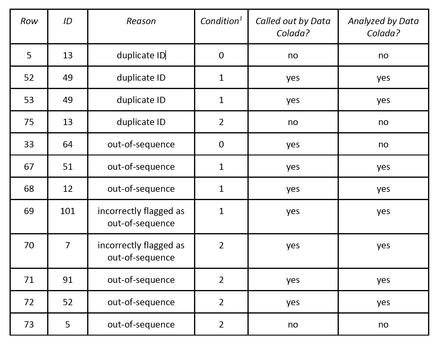
In sum, of the ten rows that should have been called out, Data Colada calls out seven and analyzes six. Data Colada also calls out two rows that shouldn’t have been called out (and they analyze both of them). In other words, out of the twelve rows at issue, Data Colada only reaches the correct conclusion for seven. That’s 58.3%, just a bit better than flipping a coin. Data Colada offers no explanation for why they cherry-picked the observations in this way.
Note: condition 0 = control condition; condition 1 = signature at the top; condition 2 = signature at the bottom
Appendix 2: Analyses of Study 1 data with exclusion of rows with duplicate IDs or out-of-sequence observations
Study 1 tested the hypothesis that signing at the top of a form (condition 1) reduces cheating as compared to signing at the bottom of the form (condition 2) and as compared to a control condition where there is no signature on the form (condition 0).
To re-run the analysis, let’s consider Expenses Claimed, the focus of Data Colada’s analysis. These are the travel expenses participants incurred to reach the laboratory that they claimed on a tax return form on research earnings (as deductions).
The study hypotheses predicted that Claimed Expenses would vary significantly across conditions (column A below). The hypotheses also predicted that Claimed Expenses would be significantly different in condition 1 as compared to both condition 0 (column B below) and condition 2 (C below), but not between these latter two conditions (column D below).
To demonstrate the extent to which Data Colada’s cherry-picking of observations (and exclusion of condition 0) created a misleading impression, I re-ran the study results in three different ways:
including all 101 observations in the study
excluding the 8 observations that Data Colada cherry-picked and flagged as “suspicious”
excluding the 10 observations that Data Colada should have flagged as suspicious if they had accurately applied their own rule
As the table below shows, the results about Claimed Expenses varying across conditions hold when looking at all the data (row 1 below). When excluding the observations Data Colada flagged as suspicious, the same analyses produce non-significant findings (row 2 below). But what happens when you run the analysis while excluding the 10 observations that Data Colada should have flagged as suspicious if they had accurately applied their own rule? The results about Claimed Expenses varying across conditions hold, in support of the study’s original hypothesis (row 3 below).

Furthermore, the original published study actually included a total of three measures of cheating to test the main hypothesis. In addition to the Expenses Claimed measure described above, the other two measures were:
percentage of participants who cheated by overclaiming self-reported earnings (income) on a task wherein participants could cheat for financial gain
average magnitude of cheating (i.e., the difference between reported and actual performance on the task)
Data Colada did not mention these measures in its analysis. However, for completeness and transparency, I re-ran the analysis myself.
As the table below shows, when examining these measures, the results again hold for all observations (row 1 below). Interestingly, the results continue to hold for these measures even when excluding Data Colada’s mistaken identification of duplicate IDs and out-of-sequence (row 2 below). Finally, the results also hold when excluding the 10 correctly flagged observations (row 3 below).
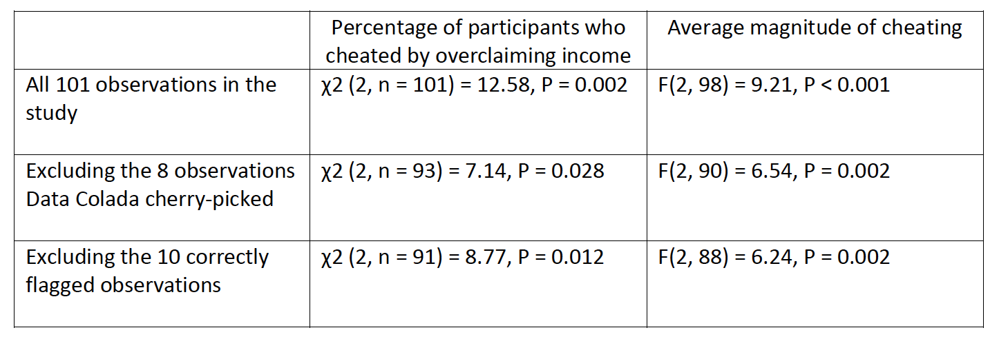
It is interesting that Data Colada only chose to show its audience the results for one of the three metrics used in this study, given that an analysis of the other two metrics fail to support their allegations. In their blog post they offer no explanation for this, nor are they transparent with their readers about the fact that they omitted this more comprehensive analysis.
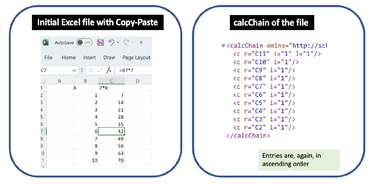
Appendix 3a – A calcChain file can reference rows out of sequence merely when a user drags Excel’s fill cursor to fill a formula entirely in sequence
Most Excel users have used Excel’s “fill cursor,” a plus sign that, when dragged, extends a formula into adjacent cells. This is a standard, simple, routine Excel procedure: Type a formula into the top row, drag down, and Excel automatically creates the formula to appropriately reference each subsequent row.
Following the example provided by Data Colada in their blog post, I entered 1, 2, 3, 4, 5, 6, 7, 8, 9, 10 as values in the cells B2-B11. I then entered a formula in C2: =7*B2. Finally, I extended the formula down by dragging the fill handle. This yielded the worksheet at left below, which is identical to the one displayed in the Data Colada post.
Let’s inspect the calcChain file. By Data Colada’s interpretation of what calcChain shows, the calcChain file indicates that cell C2 was moved manually. Data Colada would further conclude that, as a result of C2 being out of order, that I tampered with the data.
This simple example shows that calcChain does not do what Data Colada claims it does. In particular, calcChain does not show whether or how formulas were moved or what a file looked like in the past.

Appendix 3b – Excel movements are not always recorded in calcChain
Excel is well-known for offering multiple ways to accomplish a task. To reorder cells or rows, a user can Copy-Paste, Cut-Paste, or Drag-and-Move. Even though these all yield the same worksheet, they are not recorded the same way in calcChain.
Following the example provided by Data Colada in their blog post, I entered 1, 2, 3, 4, 5, 6, 7, 8, 9, 10 as values in the cells B2-B11. I then entered a formula in C2: =7*B2. I repeated this by manually entering a corresponding formula in each of the subsequent rows. This yielded the worksheet at left below, which is identical to the one displayed in the Data Colada post, and the calcChain on the right.

Next, I changed this initial Excel file by Copy-Paste of the values in B7 and C7 from row 7 into row 12, and then deleted row 7. The calcChain after these actions is exactly the same as the initial file despite the reordering.
However, if instead of using Copy-Paste, I use Drag-and-Move of the values in B7 and C7 from row 7 into row 12, and then delete the empty row 7, calcChain reveals the movement.
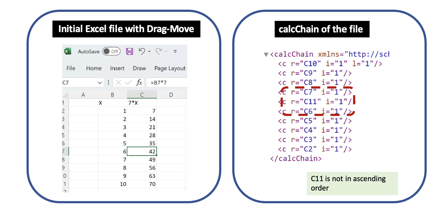
calcChain records some movement of cells in Excel while not recording others. This reinforces why Microsoft documentation is adamant that calcChain does not show whether or how formulas were moved or what a file looked like in the past.
Appendix 3c – Excel’s Sort function changes the calcChain
Start with a blank file. I entered the labels for various columns in A1-E1: condition, sex, a, b and b-a. In A2 to A11, I entered values 0, 0, 0, 0, 0, 1, 1, 1, 1, 1. In B2 to B11, I entered values 0, 1, 0, 1, 0, 1, 1, 1, 0 and 0. In C2 to C11, I added values 4, 7, 3, 2, 5, 6, 3, 4, 2, 1. In D2 to D11, I entered 25, 22, 27, 24, 23, 23, 26, 21, 22, and 23 .
Next, in E2, I added the formula =D2-C2, and then extended the formula to E3:E11 by clicking the Fill box in the lower left corner of that cell and dragging it down. In this example, the formulas in column E depend on the entries in columns C and D. This yielded the worksheet below, and the calcChain right below it.

I then sorted the dataset by the "sex" column, choosing values from smallest to largest. I made no changes to the file other than this sorting. Because of the sort, Excel automatically moved the values in columns A, C, D, and E, in a way that is consistent with the sorting. This yielded the worksheet below and the calcChain right below it.
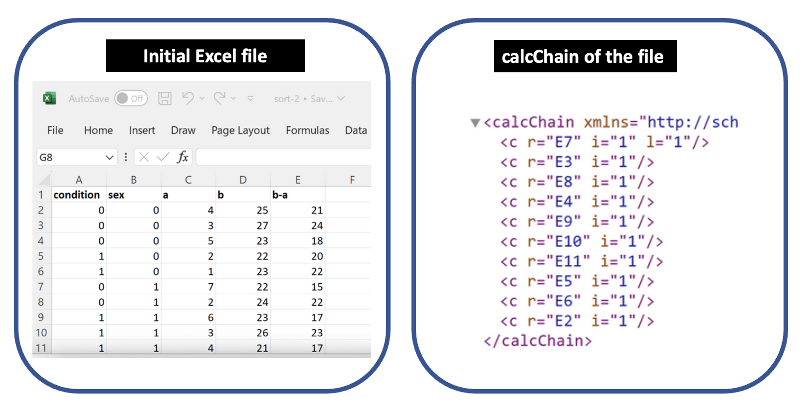
You might have expected this sorting to be reflected in calcChain, putting E4, E6, E10, E11 closer together since they were the entries with a 0 that moved with the sorting. But the calcChain file does not show that. It’s hard to see a clear pattern in the way the calcChain moved. Overall it seems somewhat random.
In some testing, Excel seemed to further reoptimize the calcChain upon further edits and saves, as if Excel eventually figures out what order is closer to optimal. In any event, the out-of-order calcChain entries can result solely from sorting the worksheet – an entirely innocuous action that researchers widely employ as they explore and examine data. Excel’s treatment of calcChain when a user sorts is yet further evidence that Data Colada was wrong to claim an out-of-order calcChain indicates data tampering.
Appendix 3d – Excel can change calcChain entirely on its own
Microsoft’s documentation for Excel files shows how calcChain can change on its own: “if a set of formulas that were previously ignored during a calculation become required for calculation…, then these formulas move to ‘first’ on the calculation chain so they can be evaluated.” This makes sense: By all indications, Microsoft’s main goal with calcChain is to calculate formulas as quickly as possible. (Imagine if some competitor did this better, and beat Excel in a speed test.) And optimizing speed means reordering the calculations into whatever order finishes the calculations fastest.
Inspired by Microsoft’s remark that Excel can move a formula earlier in the calcChain, I sought to make an example where a user fills in cells and formulas in one sequence, but Excel reorders the calcChain in order to optimize performance. I did so, as discussed below. This confirms what Microsoft’s documentation indicates – that Excel can reorder calcChain on its own, totally contrary to the sequence in which a user created cells and formulas. This further reinforces my view that calcChain is unpredictable – subject to the vagaries of Excel’s calculation engine – and not a good way to see what a file looked like in the past.
From a blank file, I entered a, b, c, d, e, f, g, h as values in the cells A1-A8. I also entered 5, 4, 3, 2, 1, 6, 7, 8 as values in the cells B2-B8. I then entered a formula in C1: =B1*B1. I repeated this by manually entering a corresponding formula in each of the subsequent rows. Next, I entered three more formulas:
D1: =min(C:C)
D2: =max(C:C)
E2: =D1*D1*D2*D2
This yielded the worksheet at left below, and the calcChain on the right. The calcChain shows the order in which the formulas were entered in Excel. (As usual, read from the bottom up.) So far, the calcChain matches the order in which I entered the formulas.
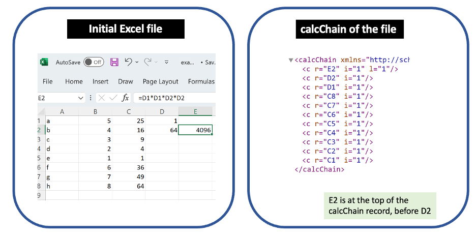
Next, I changed this initial Excel file by selecting A8:C8 and performing drag-fill down to A16:C16. This yielded the worksheet at left below, and the calcChain on the right. Note that I did not manually change nor move the following cells with formulas: D1, D2 and E2. Yet, inspecting the calcChain reveals that D2 now interrupts the order of the cells I did change: C9 through C16.
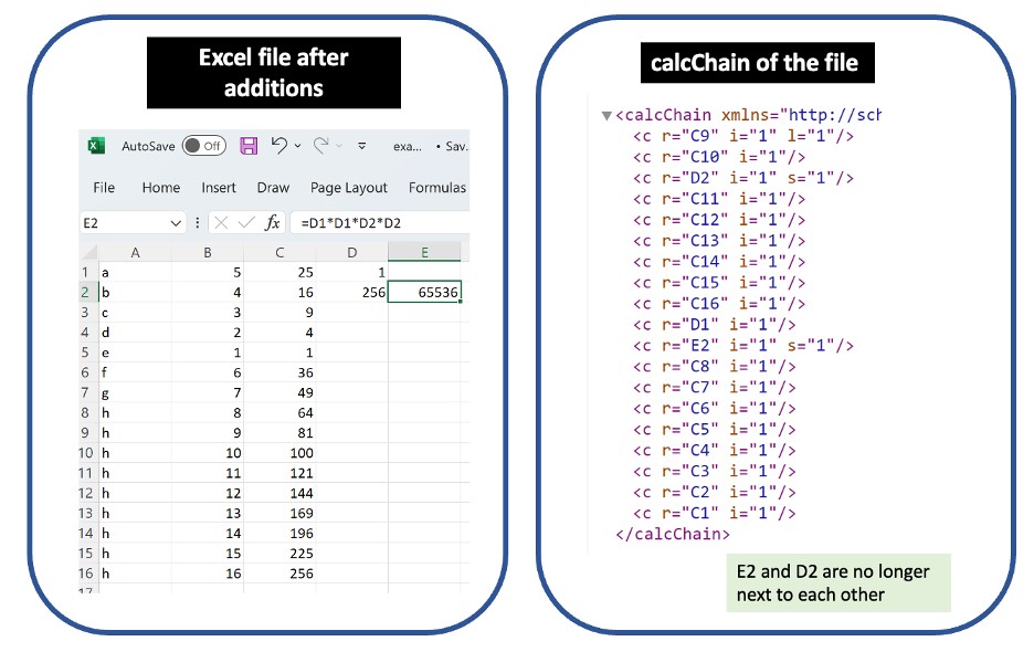
Although I did not move D2 in the worksheet, that cell did move in the calcChain. The takeaway: Human action in one part of the spreadsheet can cause a move in calcChain about a cell in an unrelated part of the spreadsheet.
And what specific move is seen in calcChain? Recall that cell D2 is the max of column C. Excel seems to have at least partially realized that it’s faster to calculate all of column C, and then calculate D2. As of the calcChain shown above, Excel hasn’t quite figured that out all the way – Excel still puts D2 below C9 and C10, cells that in principle could change D2. In other testing, I found instances where Excel further reoptimizes calcChain on its own. (The more complicated the file, the more likely Excel is to reoptimize it on its own. So it’s correspondingly more difficult to reproduce those examples.) And all of this makes sense in light of Microsoft’s documentation and the stated purpose of calcChain – not intended to provide any kind of version history or time machine, but rather solely to finish calculations faster.
A skeptic might accept that some Excel files are complicated enough that Excel reorders their calcChain – but ask whether my file has that level of complexity. Let me offer two answers to that. One, a file actually doesn’t have to be particularly complicated to prompt Excel to reorder its calcChain. My example has just 19 formulas, and Excel still reordered it. Two, the file at issue for this study actually was relatively complicated. It had 101 rows times six columns with formulas (a total of 606 cells with formulas). Notably, some formula cells depended on other formula cells, and the formulas were three levels deep. This complexity created considerable room for Excel to reorder calculations to optimize speed. The file at issue was certainly more complicated than my sample in this section.
If calcChain moves all represent changes by human hand, as Data Colada claimed, none of this could have happened. But Data Colada is wrong, and in fact calcChains can change for many reasons including Excel optimizing on its own.